Ich befinde mich gerade auf einer sogenannten ‚Malreise‘ im wunderschönen Ostfriesland. Wie so oft an der Küste ist das Wetter unbeständig, was zumindest am ersten Tag nicht so schlimm war, da wir Theorie gemacht haben. Die Kursleiterin Anke Gruss ist eine prima Lehrerin. Besonders erhellend fand ich gestern die dritte und vierte Übung, in denen es um Tonwerte ging. Mit einer fünfwertigen Tonskala haben wir kleine Kompositionen gezeichnet und gemalt. Ich habe herausgefunden, dass ich in den helleren Tönen mehr Raum geben muss. Gerade in Bereichen, wo mehrere Linien und Tonwerte aufeinanderprallen, wie z.B. bei Tassenhenkeln wird es unübersichtlich, wenn die Werte nicht gut ausgearbeitet sind. An dem Henkel der Bleistiftzeichnung habe ich deswegen einige Zeit arbeiten müssen. Würde ich stringent solche kleinen Skizzen zeichnen, bevor ich überhaupt einen Pinsel in die Hand nehme, würde ich wahrscheinlich viel stimmigere Bilder malen. Denn mit diesen Skizzen kann man schon im Vorfeld Lichtdramaturgie und Komposition austesten. Auf der Basis dieser Vorstudien könnte ich jetzt mit größerer Klarheit ein Tassenstillleben anfangen – steht aber nicht auf dem Programm, denn heute wollen wir en plein air malen, juhu!
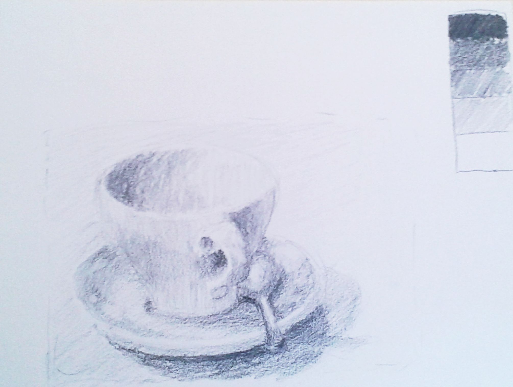
Erste Übung: Fünfwertige Tonskala mit Bleistift
First exercise: Five-step value scale in pencil
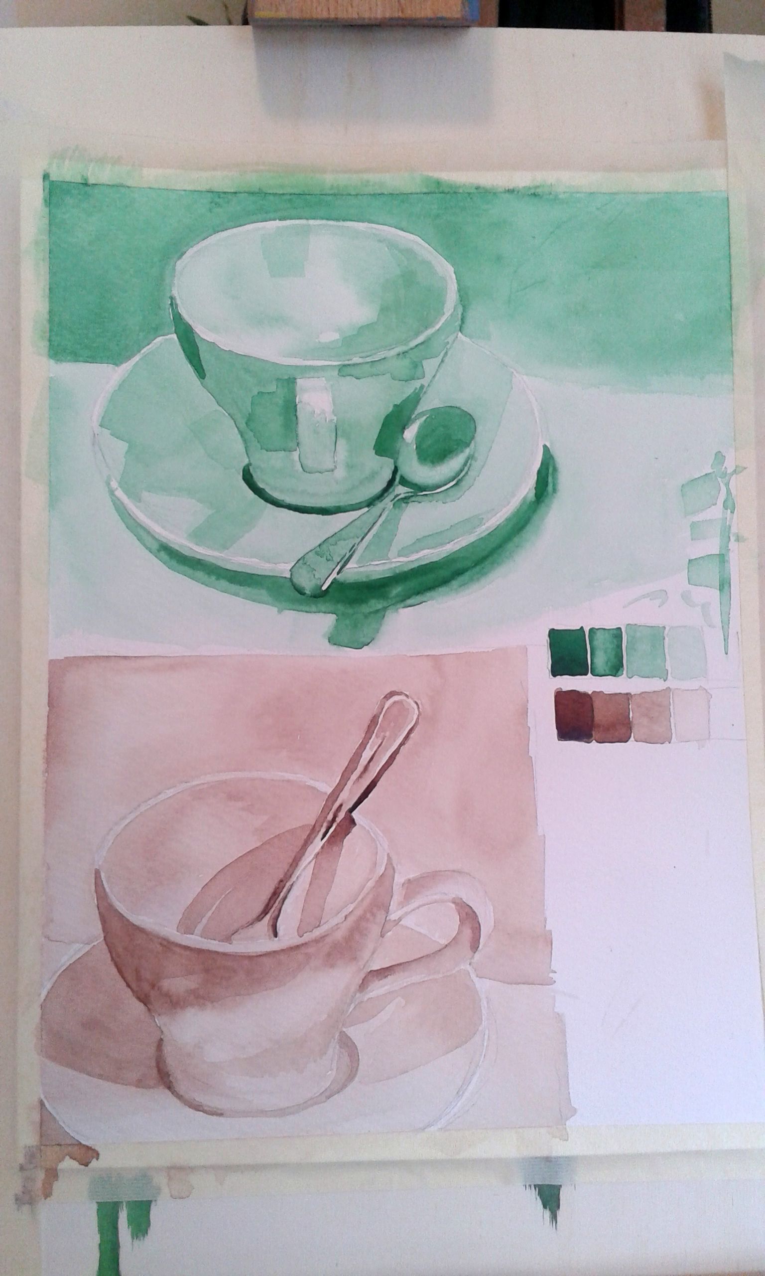
Zweite Übung mit fünfwertiger Tonskala in Farbe (Aquarell)
Second exercise: Same exercise in colour (I used watercolours)
I am currently away on a painting holiday to Estern Friesland at the North Sea Coast (think: muddy beaches, flatflatflat, dykes, sheep, lovely red-brick houses). The weather is quite changeable with lots of showers travelling through. This didn’t matter much yesterday which was Day One on this educational-cum-creative journey because it was THE THEORY DAY. Our instructor Anke Gruss is simply marvellous! She really teaches us the basics of painting so that we can go off and improve as painters. We learned very fundamental lessons about value yesterday. I already knew before that value is key and I think I can see values quite well. But as I found out yesterday I struggle to render it. Especially the lighter values get flattened out in my drawings. This creates huge problems in areas where several lines and values meet as is the case in and around the cup handles in the above sketches. Took me a fair amount of work! But the results are ok. If I wanted to paint a little cup now I would profit from these exercises (but I think we’ll paint en plain air today). I truly wish I was disciplined enough to do tonal studies for paintings; I am beginning to think that I really should do that more often and more stringently. That way, I could clarify important lighting and composition issues before I take up the brush and leave the painting process to focus on colour temperature and such issues.
Trackbacks/Pingbacks