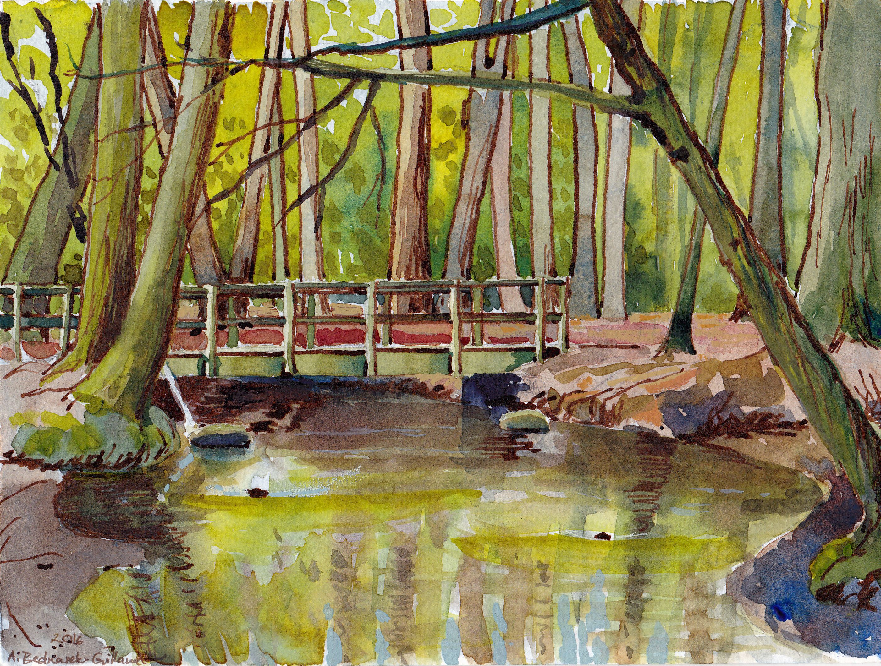
I used transparent yellow, ultramarine and magenta for for this one, and white gouache. The ink is W&N, I think.
I always like having a structure as my focal point, especially when I’m out amongst greenery. This little bridge across a nearby forest stream is really neat. It’s not quite as light in value as I painted it but I thought it would stand out more that way. Note to self: the ink lines in the background trees could be slimmer. But then again, the reddishness of the brown ink is pretty fascinating 🙂
Ich mag es, als zentralen Orientierungspunkt im Bild eine gebaute Struktur zu haben, ganz besonders, wenn ich mitten im dichten Grün des Waldes bin. Diese Brücke und der Bach sind daher ideal zum Malen. Eigentlich ist die Brücke etwas dunkler, aber ich habe sie hell gelassen, damit sie sich etwas mehr abhebt. Kleine Notiz für mich: die Tuschelinien bei den Bäumen im Hintergrund könnten dünner sein. Obwohl – so sieht man den faszinierenden Rotton dieser brauen Tusche besser 🙂