This painting was a present for a family friend. Kerstin is always there to help when help is needed and she is a wise and very kind person. I did something different for this painting: I used cobalt blue instead of ultramarine which is my normal go-to blue, and it works so well in this painting that I am honestly asking myself why I don’t use it more often. I remember that my first serious teacher did not recommend cobalt blue to me – maybe I simply continued to think that it’s better not to use it? ‚This painting shows that there is little point to that. The palette for it was: delft blue (S), cobalt blue, burnt umber, burnt sienna, opera rose, aureolin yellow (all W&N), translucent yellow (S), green umber (S).
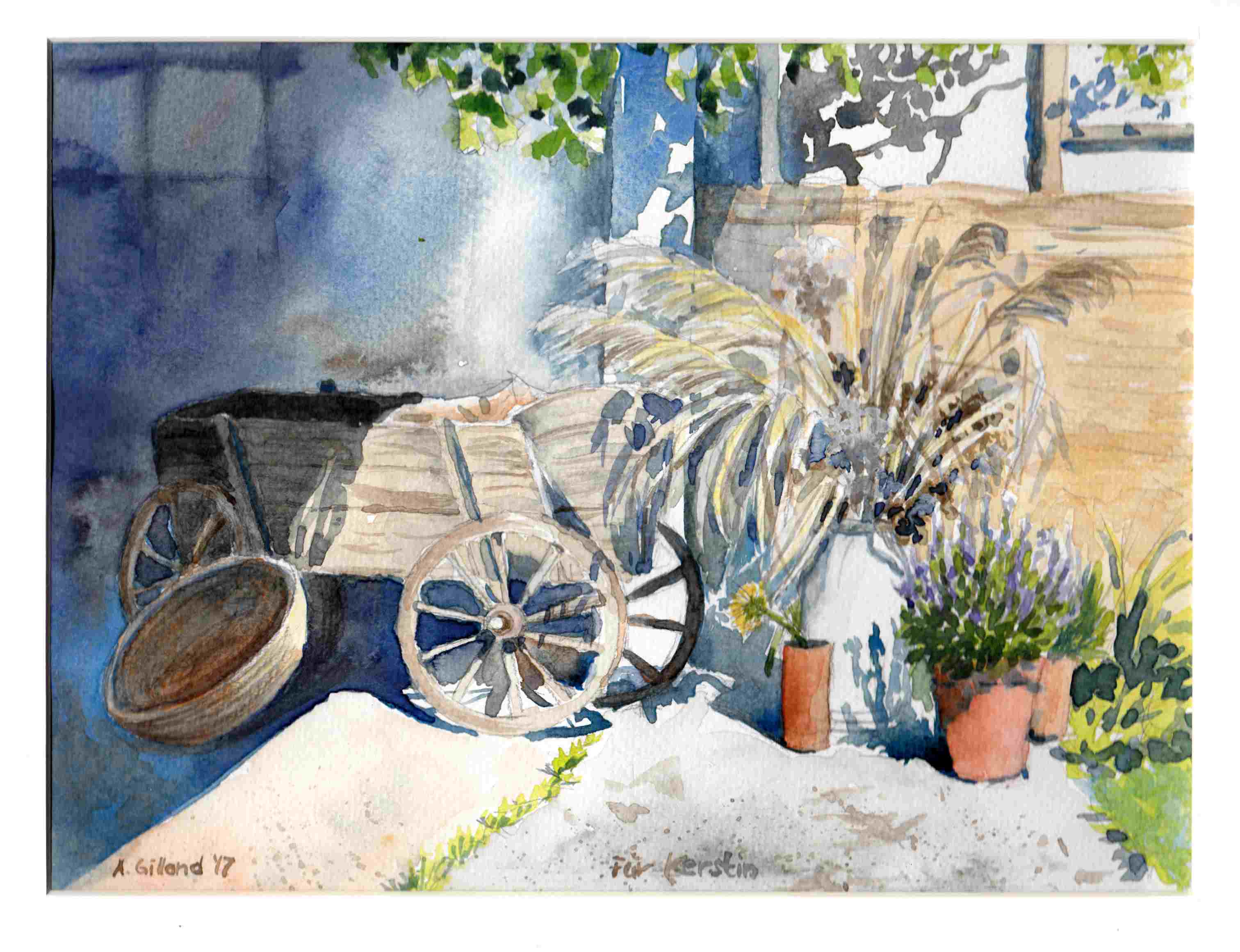
Dieses Bild war ein Geschenk für eine gute Freundin der Familie. Kerstin ist immer da, wenn man sie braucht, das ist was ganz Besonderes. Noch dazu ist sie lieb und weise zugleich 🙂 Ich habe hier was Neues gemacht, was ich normalerweise nicht mache: ich habe Kobaltblau statt Ultramarin benutzt, welches eigentlich mein häufigstes Blau ist. Es steht dem Bild so gut zu Gesicht, finde ich, dass ich mich echt frage, warum ich Kobaltblau so selten benutze. Vielleicht weil meine erste ernsthafte Lehrerin mir davon abgeraten hatte? Da gibt es offensichtlich keinen Grund für. Meine Palette für dieses Bild war: von Schmincke Delftblau, Lasurgelb und Umbra grünlich, von Winsor & Newton Kobaltblau, Umbra gebrannt, Terra di sienna, Opernrosa, Aureolingelb.
Warum hat sie Dir denn von Kobaltblau abgeraten?
Hallo Annette, ich weiß es ganz ehrlich nicht, werde sie die Tage aber mal fragen. Meine ersten beiden Blaus waren Ultramarin und Phtalo.
Ich bin ja Autodidaktin und probiere entsprechend rum. Kobalt nehme ich selten, vielleicht, weil es so sehr präsent ist.
So war es bei mir auch lange Zeit. Ich habe jetzt übrigens eine Antwort von meiner früheren Lehrerin bekommen. Ich habe ja mit Ölfarben angefangen, und sie fand damals, Kobaltblau wäre einfach nicht so interessant wie andere Blaus und für Anfänger nicht geeignet, weil man eigentlich immer viel dazumischen muss, um es interessanter zu machen. Bei Aquarellfarben finde ich das nicht – und sie auch nicht. Rätsel gelöst 🙂
🙂