I felt an itch yesterday to get out the ink bottles and nibs to draw a figure. Unfortunately I pulled the label off my ink bottle, so I can’t tell you what brand it is. But it is amazing! Runs really smoothly even on Ingres paper like here. The great thing about drawing with ink and a dipping pen is that your lines come out differently all the time, thereby lending the drawing a more organic and loose feel. This did happen here, too, and I am pleased with that. I used a white pastel pencil for the hoghlights and a red chalk stick for the darker tones.
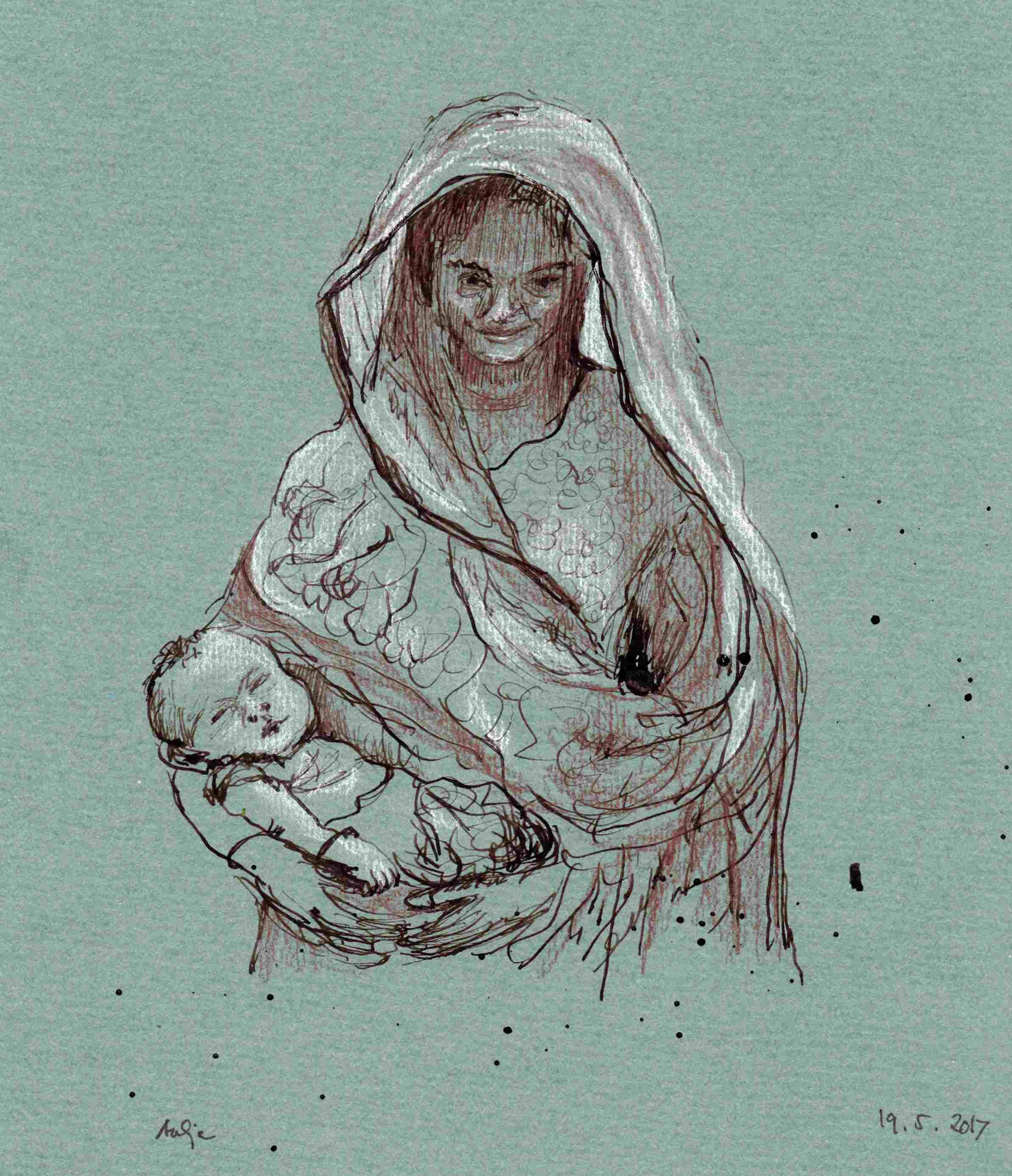
Woman with baby. Reference photo from DIE ZEIT. | Frau mit Baby. Nach einer Fotovorlage aus der ZEIT.
Gestern habe ich plötzlich starke Lust verspürt, meine Tuschefässchen und Zeichenfedern hervorzukramen und eine oder mehrere Personen zu zeichnen. Leider habe ich das Etikett von meiner Sepiatusche abgezogen, deswegen kann ich euch jetzt gar nicht sagen, welche Marke sie ist. Aber sie ist prima! Läuft sehr sanft über die Feder und aufs Blatt, sogar auf Ingres-Papier so wie hier. Das Tolle am Zeichnen mit Tusche und Feder ist für mich, dass die Striche nie gleich werden, sondern immer mal etwas dicker oder dünner rauskommen. Dadurch wird die Zeichnung natürlicher und lockerer. So war es hier jedenfalls, und das gefällt mir auch ganz gut. Für die Lichter habe ich einen weißen Pastellstift benutzt und für die mittleren Tiefen einen fetthaltigen Rötelstift.
Dein Bild ist Dir sehr gelungen! Das zusätzliche Zusammenspiel mit Kreide und Rötelstift ist Klasse!
Danke Uwe!