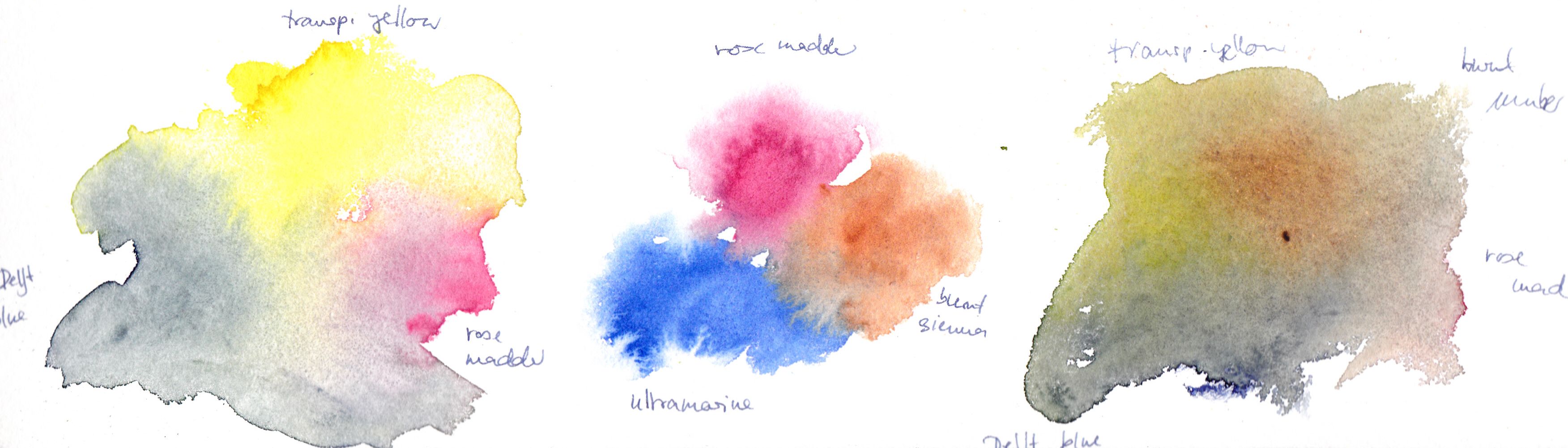
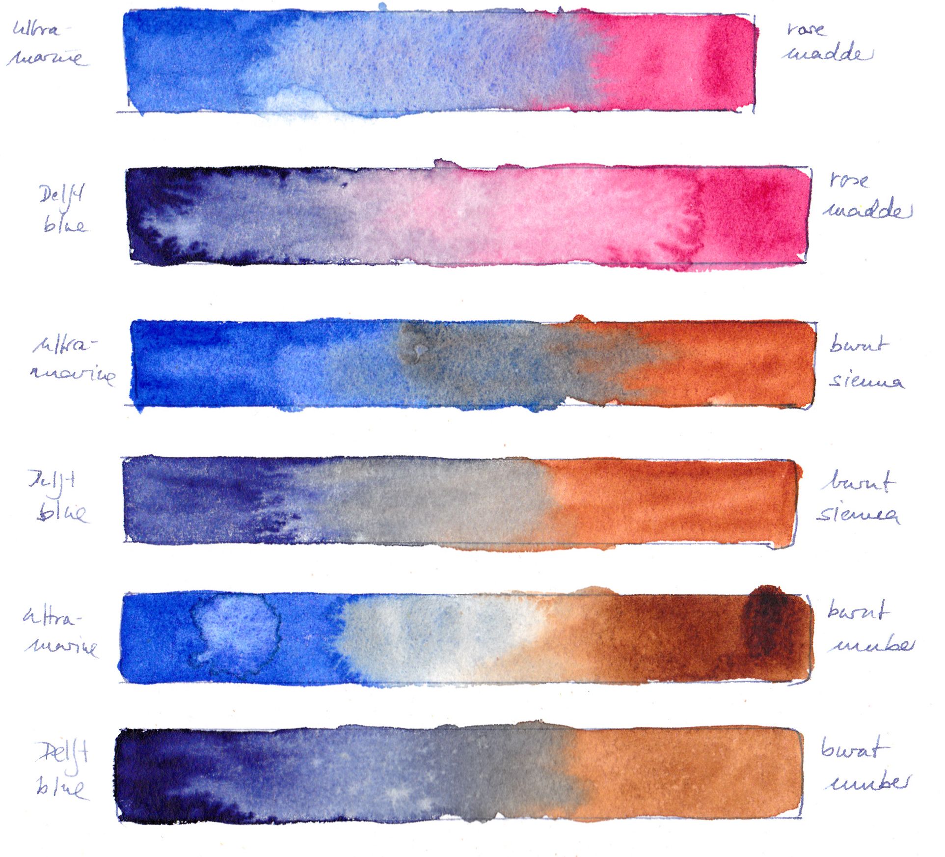
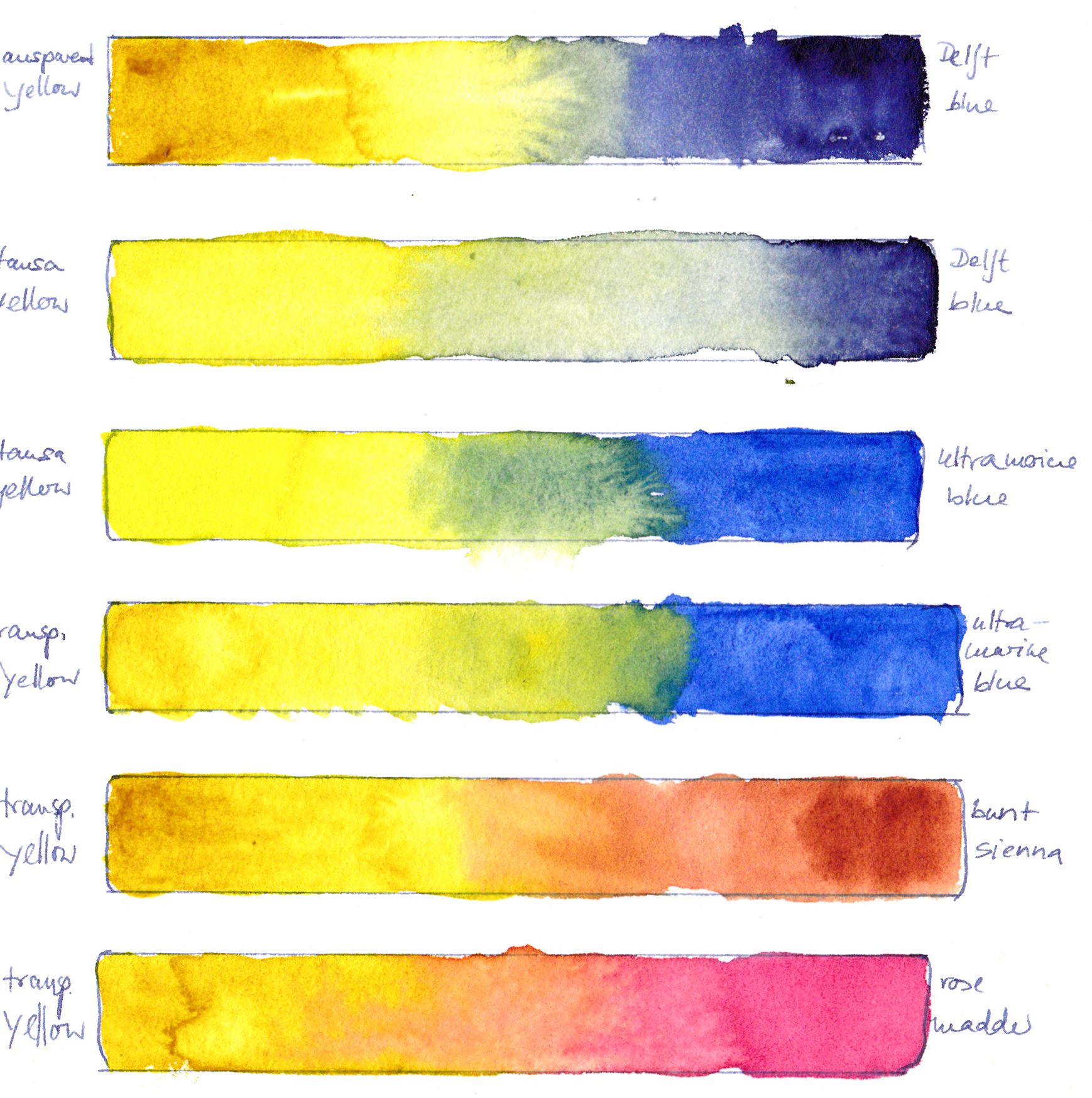
This week I want to do a series of technical posts about colour and realistic painting. The main reason for this is that I have finally got around to swatching my watercolour tube paints. My primary interest was in testing my new Delft Blue (Schmincke) and my Transparent Yellow (also Schmincke) which is very like Quinacridone Gold except that it isn’t. As I was at it I kep on trying my new red which is Rose Madder (Schmincke). See for yourself! Delft Blue is a deep and cold blue which makes lovely neutral shades. It might become my second favourite blue next to Ultramarine. Not sure about Rose Madder; it’s pretty weak.
Diese Woche möchte ich Technisches besprechen, hauptsächlich Farben und Farbmischungen. Der Grund dafür ist, dass ich am Wochenende endlich mal die Gelegenheit hatte, meine neuen Tubenfarben komplett und ausführlich zu testen. Besonderes Augenmerk galt meinem neuen Delftblau, Lasurgelb und Rosa-Krapplack (alle von Schmincke). Alles Farbmischungen, von denen ich schon viel gehört hatte. Delftblau ist schön dunkel und kühl und ergibt interessante neutrale Farbtöne. Vielleicht wird es mein zweites Standardblau neben Ultramarin. Wegen Rosa Krapplack bin ich mir nicht sicher; ich sehe in diesem Farbton keinen großen Gewinn. Da komme ich mit Magenta und Geld auch hin, glaube ich, oder?